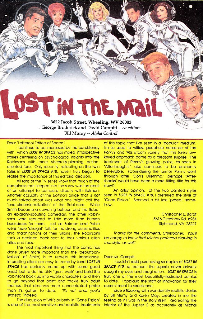
HOME
HOME
- The Collection
- Irwin Allen
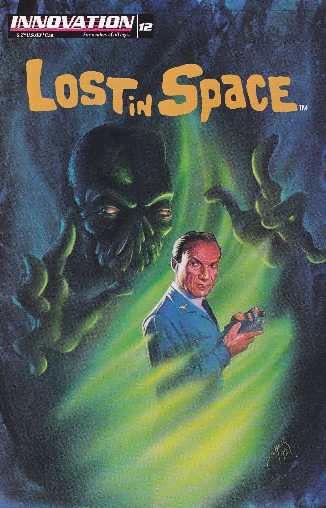
- Lost in Space
- Lost in Space Cast
- Lost in Space Movie
- Lost in Space Movie Cast
- Lost in Space Netflix
- Lost in Space Netflix Cast
- Land of the Giants
- Land of the Giants Cast
- Time Tunnel
- Time Tunnel Cast
- Voyage to the Bottom of the Sea
- Voyage to the Bottom of the Sea Cast
- Other Collectibles
- Other Collectibles
- The Adams Family
- Battlestar Galactica
- Batman
- Creature from the Black Lagoon
- F Troop
- Forbidden Planet
- Gort
- I Dream of Jeannie
- Lassie
- Leave it to Beaver
- Monsters
- Mork and Mindy
- My Favorite Martian
- Planet of the Apes
- Robby the Robot
- Sci Fi
- Star Trek
- Star Wars
- Superman
- The Green Hornet
- The Incredible Hulk
- The Invaders
- The Jetsons
- The Munsters
- Ultraman
- Wil Wheaton
- Misc Items
- Auctions
- Uncle Odie Exclusives
- Anti-Matter World
- Attack of the Monster Reviews
- Attack of the Monster Reviews
- #7.1 LiS - LIS 4th Season
- #6.4 TT - LOST IN TIME - Rendezvous With Death
- #6.3 LiS - The Great Vegetable Rebellion - Part 3
- #6.2 LiS - The Great Vegetable Rebellion - Part 2
- #6.1 LiS - The Great Vegetable Rebellion - Part 1
- #5.4 LotG - BEHIND THE LAND OF THE GIANTS
- #5.3 LotG - Pay the Piper
- #5.2 LiS - Space Creature
- #5.1 ONE-EYED WONDER
- #4.4 'LOST IN SPACE' INVADES FAO SCHWARZ (1998)
- #4.3 Time Travelers
- #4.2 LiS - Forbidden World
- #4.1 LiS - No Place to Hide Part 3
- #3.5 LiS - No Place to Hide Part 2
- #3.4 LiS - No Place to Hide
- #3.3 VttBotS - Cave of the Dead
- #3.2 LOST IN XEROXES - Part 2
- #3.1 LOST IN XEROXES - Part 1
- #2.5 LiS - The Derelict
- #2.4 LiS - The Anti-Matter Man
- #2.3 TT - Chase Through Time
- #2.2 City Beneath the Sea
- #2.1 LotG - Manhunt
- #1.8 LiS - Condemned of Space
- #1.7 TT - Rendezvous With Yesterday
- #1.6 LotG - The Crash
- #1.5 LiS - My Friend Mr. Nobody
- #1.4 Man from the 25th Century
- #1.3 TT - One Way To the Moon
- #1.2 Remembering Land of the Giants
- #1.1 LiS - Welcome Stranger
- Award Contest
- In Loving Memory
- Interviews
- Special Events
- That Does Not Compute!
- Model Tips by Simon Mercs
- Friends of the Internet
- LISFAN Press/Lost in Space Fannish Alliance by Flint Mitchell
- Flint Mitchell
- Lost in Space Episode Guides
- Finder's Keeper's
- Finder's Keeper's Historyl
- Keep in Touch
 About
About
 EMail Me
 TOP |
TOP |  PREVIOUS ITEM | NEXT ITEM
  ( 107 of 312 )